Turn Custom T-Shirt Designs Into Reliable Sales
Some T-shirts look amazing in your design file, then flop the second they hit your store. The idea is cool, the art is fun, but shoppers scroll right past or never wear it again after buying. That is not a design problem; that is a sales problem hiding inside the design itself.
When we design custom T-shirts, we are not only creating artwork. We are building a product that has to sell, photograph clearly, print clean, feel good, and make sense for a real person with a real style. A few small mistakes with strategy, color, placement, or print method can hurt add-to-cart rates, returns, and repeat orders. In this guide, we will walk through the most common design mistakes we see and how to avoid them so your next drop has a better chance to become a steady seller.
Designing Without a Clear Buyer in Mind
The biggest mistake is starting with a random idea instead of a clear buyer. When you try to make a shirt “for everyone,” you usually end up with something that connects with no one. Generic sayings, vague graphics, and random fonts feel safe, but they rarely build real fans.
Ask yourself simple questions before you even open your design software:
- Who is this shirt for, in one short sentence?
- What do they care about or joke about?
- What style do they already wear?
- Would they actually wear this more than once?
Another piece people skip is thinking about where and when the shirt will be worn. Heading into warmer months, buyers in many areas want:
- Lighter fabric that breathes at festivals, parks, and outdoor events
- Colors that look good in the sun and in photos
- Fits that work for casual days, travel, and team outings
Season and use case guide choices like fabric weight, sleeve length, and base colors. A heavy, dark tee might feel great in a cool studio but stay stuck on the rack when the weather heats up.
You also want each design to match your brand’s tone. If your brand is clean and minimal, a loud, busy graphic with neon colors can feel off. If your brand is playful and bold, a stiff, corporate style design confuses shoppers. When the design, message, and brand story line up, buyers trust you more and come back for the next drop.
Overcomplicating Artwork and Killing Wearability
A common trap is putting way too much into a single shirt. On a screen, you can zoom in and admire tiny lines, little icons, and long quotes. On a real shirt, viewed from a few feet away, all that detail turns into noise.
Watch for these red flags:
- Very small text that needs zooming to read
- Super thin lines that disappear once printed
- Crowded layouts with art, text, and logos all fighting for attention
Different print methods also have different limits. DTG can handle more colors and gradients, but tiny linework can still blur if you push it. Screen printing loves bold shapes and solid colors, but very complex color blends can be tricky. Embroidery needs clean, simple artwork with clear shapes, or the thread starts to clump.
Every strong shirt has a clear focal point. Decide what matters most: a phrase, a logo, a main graphic. Then use secondary elements to support it, not compete with it. When shoppers glance at your product photo, they should understand the message in one second. If they need to stare to figure it out, they move on.
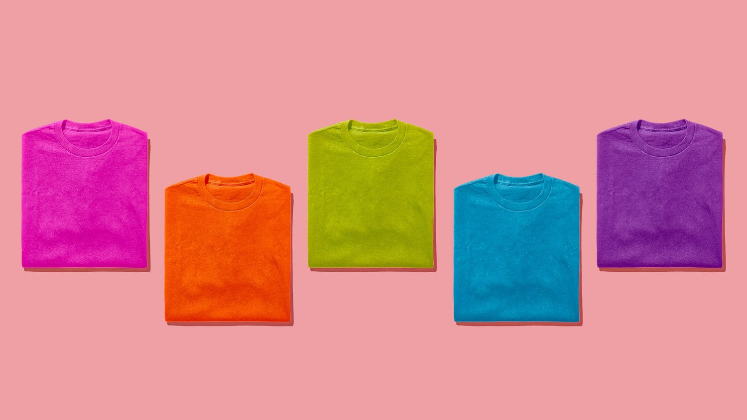
Poor Color Choices That Sabotage Your Design
You can have solid artwork and still lose sales if the colors do not work on real fabric. Low contrast is one of the biggest silent killers. Dark gray on black, pastel yellow on light heather, or pale blue on white may look “cool” up close, but in photos and quick views they almost vanish.
To avoid this:
- Check your design zoomed out and in grayscale to test contrast
- Make sure text and key graphics pop against the shirt color
- Think about indoor lighting, outdoor sun, and low light photos
Chasing every color trend can also backfire. One season, everyone wants a certain bright shade. The next season, it feels old. Instead of building your whole line around short-lived colors, tie your choices to your audience and your brand. Use trend colors as accents, not your whole story.
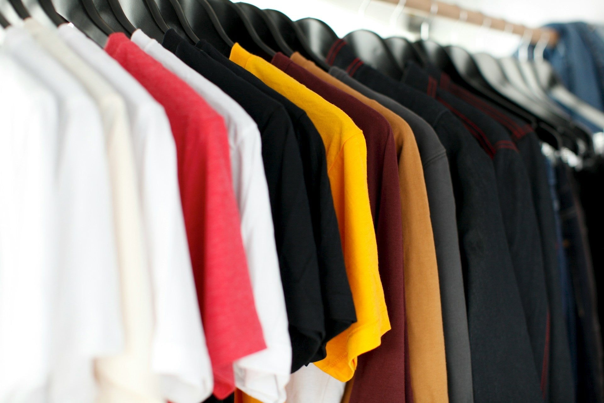
You also have to remember that ink prints differently on various fabrics. Cotton, blends, and different shirt colors all affect how bright or muted a print looks, and how it ages after washing. A color that looks strong on a white cotton tee might look flat on a dark blend. Working closely with your print partner and testing on real blanks helps keep your designs looking sharp long after launch.
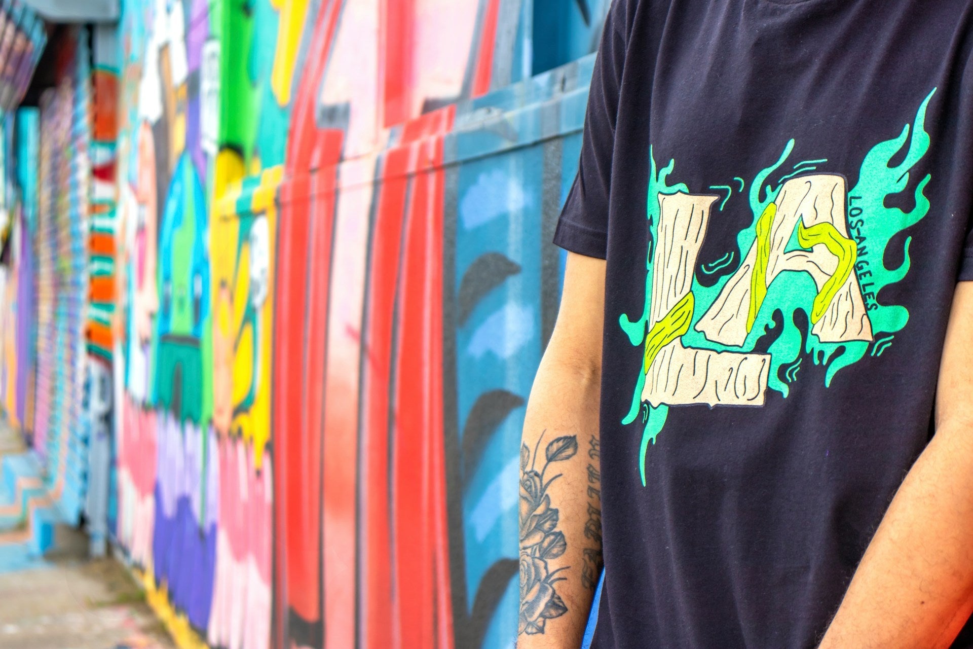
Misplaced Prints and Unflattering Layouts
Even beautiful artwork can look cheap if it is placed wrong. Common placement issues include:
- Design printed too high, almost on the neck
- Artwork pulled too low, floating on the stomach
- Graphics wrapping awkwardly around the side of the body
Placement affects how flattering the shirt is on different body types. Center-chest prints that sit in the right spot tend to look better and feel more premium. Oversized prints can be great, but they need thoughtful positioning so they do not twist or fold in strange ways when the shirt moves.
Size scaling is another detail people skip. Printing the exact same size graphic on XS through 3XL sounds simple, but it can look tiny on larger sizes and huge on small ones. Adjusting the scale for size ranges keeps the design balanced, which matters a lot for unisex and family sets.
Before you release a new design, take time to review:
- Flat mockups on the correct shirt colors
- On-body mockups that show different sizes
- At least one real sample so you can see it from a distance
What looks fine on a flat template might distort on a real person. Catching that early protects your brand and your reviews.
Forgetting Fulfillment Realities and Print Costs
Designing custom T-shirts without thinking about production can cause a lot of pain later. Oversized front and back prints, loads of colors, or all-over designs may look awesome, but they change how the shirt is printed, packed, and shipped. If the design is hard to produce, it can slow down orders and limit how quickly you can restock.
It also matters which print method matches your idea. In general:
- DTG works well for detailed, multi-color artwork on smaller runs
- Screen printing is great for bold graphics, fewer colors, and larger runs
- Embroidery fits clean logos and badges
- Tie-dye adds unique patterns that work best with simpler art
When the method and the artwork do not match, you often see quality issues, returns, or designs that do not live up to the mockup.
If you plan to do dropshipping or print-on-demand, think about inventory and shipping from the start. Designs that rely on rare blanks, tricky color matches, or intense manual work can be harder to fulfill at scale. Planning with a full-service partner helps avoid stockouts, slow shipping, and disappointed customers, especially when orders spike during spring and summer.
Before you launch your next design, give it a quick audit:
- Who is this for, and where will they wear it?
- Is the message clear from a few feet away?
- Do the color and placement work on real shirts and bodies?
- Does the design match the best print method for quality and speed?
Fixing these common mistakes early turns your ideas into products that look great online and in person. At Factory 1 Direct, we help brands, businesses, and creators bring designs to life with the right blanks, printing methods, and fulfillment support so every drop has a better chance to become a repeat seller, not a one-time miss.
Get Started With Your Project Today
Bring your idea to life with custom shirts that fit your brand, event, or team perfectly. At Factory 1 Direct, we make it simple to design custom t-shirts that look sharp and hold up wear after wear. Share your vision, choose your colors and styles, and we will handle the rest with fast, reliable production. Start now so your shirts are ready when you need them.
Leave a comment
This site is protected by hCaptcha and the hCaptcha Privacy Policy and Terms of Service apply.